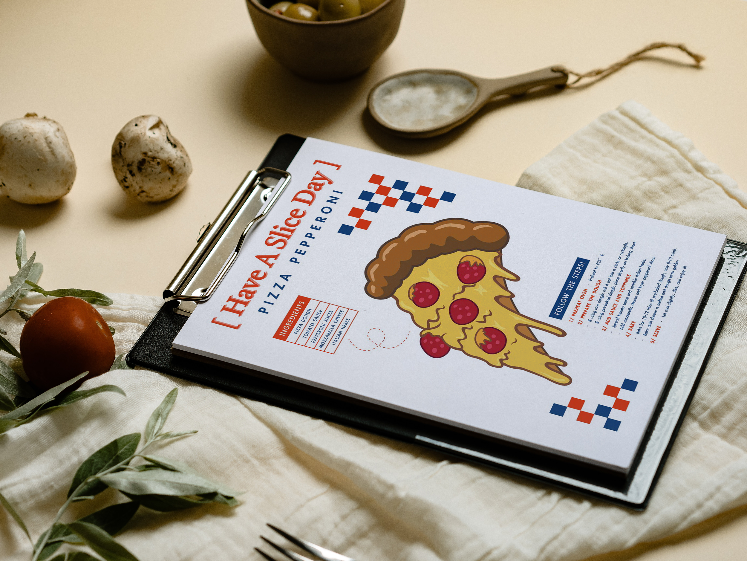
have a slice day
[ Problem Definition ]
This project aimed to design an infographic poster that visually demonstrates how to make a pepperoni pizza—from ingredients to the final slice—all within a single composition. The challenge was to create a layout that balances clarity, aesthetic appeal, and creativity, allowing viewers to follow the recipe easily without lengthy text.
[ Process Overview ]
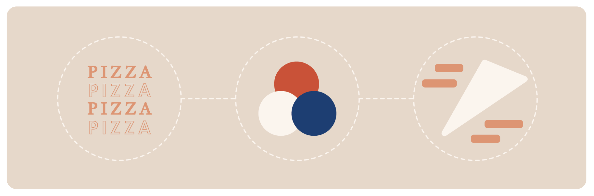
The process began with research on pizza-making steps and the visual identity of American diners. I explored how red, blue, and white color palettes evoke warmth, nostalgia, and energy. Pencil sketches were first used to draft the composition, deciding where text and visuals should be placed. Each element was then refined digitally to ensure balance, hierarchy, and flow.
[ Research Highlights ]
01 / Users respond best to short, list-based steps rather than paragraphs.
02 / Grouping visuals improves comprehension and memory retention.
03 / Red and blue tones enhance appetite and emotional engagement.
This research guided my design toward a structured yet lively composition that turns a cooking process into a visual experience.

[ Results ]
When tested with peers, the poster received positive feedback. Even those with little cooking experience felt encouraged to try making pizza. The clear structure, vivid imagery, and friendly color palette made the information feel both useful and delightful.
[ Reflection ]
This project deepened my understanding of how design can simplify learning. A well-designed infographic not only informs but also inspires action. Through this process, I learned to merge function with beauty — turning a simple cooking guide into a visually engaging story. In the future, I hope to refine the layout for better accessibility and expand the series into a collection of home-cooking visuals.
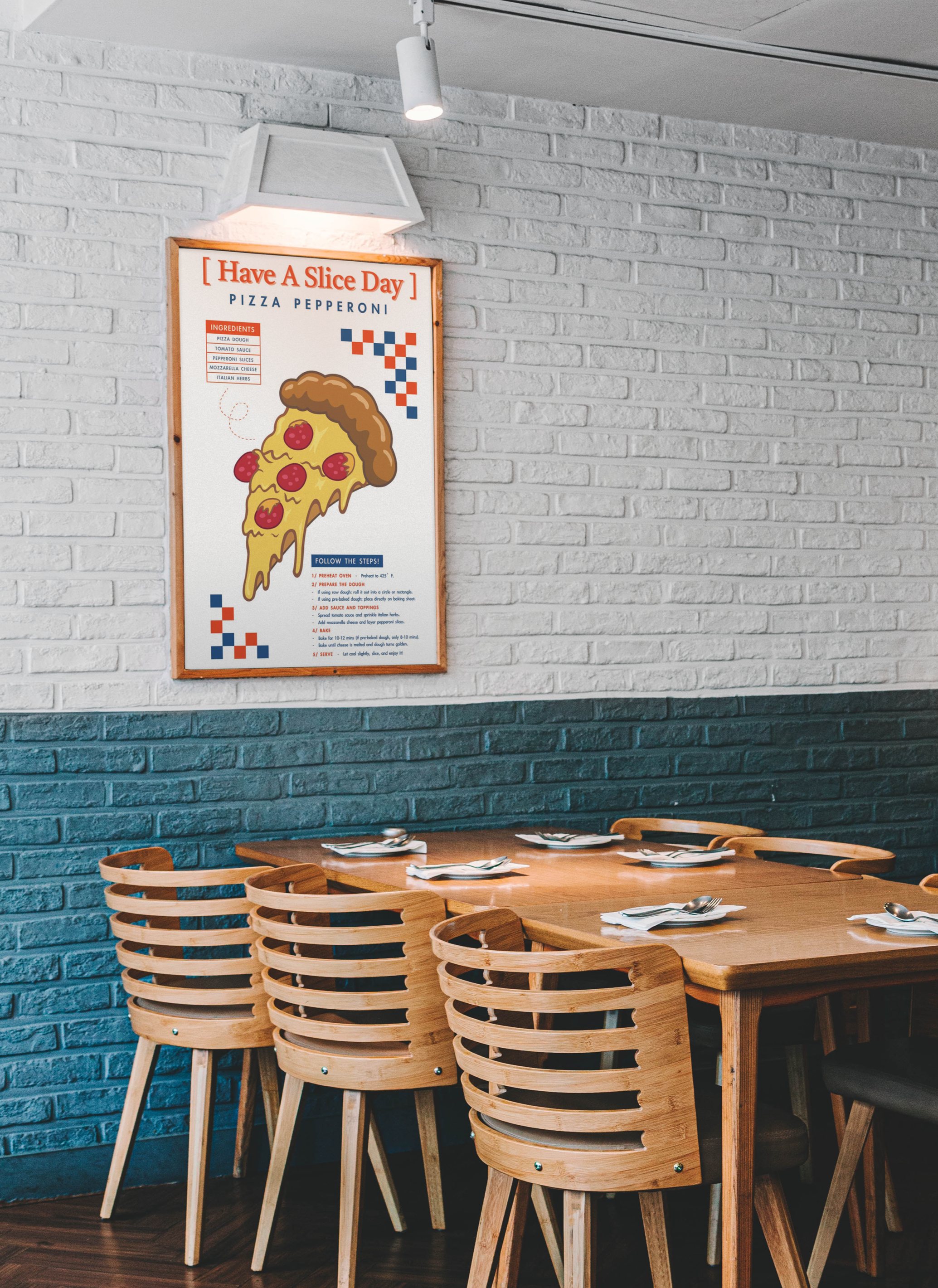
Pepperoni Pizza Process – Infographic Poster
[ Deliverables ]
The final deliverable was a full-color infographic poster that clearly displays ingredients and five steps—from preheating to serving.
Typography / The body text uses a highly readable sans-serif typeface,
while the main title features a serif font to create contrast
and visual distinction.
Color Palette / Red, white, and blue to reflect an American-style pizza
aesthetic.
Design Layout / Central pizza illustration surrounded by evenly spaced
text blocks for a balanced, appetizing feel.